Hello there, my fellow readers, we’re going to learn something completely new in web development. In today’s blog, we’re going to be talking about the most annoying websites that I’ve ever seen and what I would do to try and fix it. Have you ever gone onto a website and just didn’t get a good vibe from it as well as noticed many things wrong with the website itself, like: clutter text, pixelated images, little or no information, etc. That’s the type of thing we’re going to be talking about today, so without further ado, let’s get started.
What exactly are annoying websites and what should you look for?
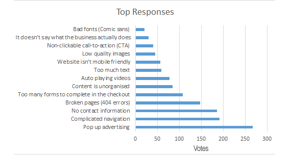
Annoying websites is just when a website is unorganized or doesn’t have the necessary information and/or properties to what a user is looking for and what a website should usually have on it. It can also be a type of functionality or interaction within the website that doesn’t give out the best results, that can be annoying and can concern some people. Like we talked about in the beginning, there are many different factors and things that come with websites that can be annoying to people including:
- Unclear purpose
- Poor implementation
- Small text
- Poor social media connectivity
- Slow loading speed
- Not optimizable on mobile devices
- Excessive pop-ups
What annoying website did I find and what was annoying about it?
I did manage to find a website that was quite annoying, here’s the link to the website: https://news.ycombinator.com/item?id=30335302
This website name is the Hacker News which gives out different news reports of hackings and has different menu options like: “new”, “past”, “comments”, “ask”, “show”, “jobs”, “submit”, and “login”. The nav bar has an orange linear background and the rest is a gray box that contains the information. These are some of the things I found very annoying within the website:
- There were no images within the site, no visual representation
- Much of the information and text are in clutter
- There is no given introduction or purpose on what the site is about
- The search bar is on the bottom of the page
- There are two buttons that transfer the user to the same page in whether they want to login or create an account
- It doesn’t have a pattern color palette to it
- The nav is very small as well as one option is on the far right
- No Search Engine Optimization (SEO)
- Explanation on different things
- Many links within the site
Those are just some of the main things that I saw within the site that were problematic. So next, this is what I would fix on the site.
What would I fix on the website?
Here’s what I would try to do to attract more user to this website:
- Try adding more images to your site to give people a better understanding and visual effect as to what your talking about.
- When the user clicks on the site, be sure to give them a little introduction to the site and/or what purpose the site is for to give the user a better understanding of the website.
- The search bar needs to be align to the right to give the name of site more space as well as increase the size of the orange box.
- Create space within the site so that the user is able to navigate more easily and find what they’re looking for.
- Try to delete either the submit or login option so that there won’t two buttons leading to the same page.
- Try to make a presentable color palette to give off a vibe to the user and what your about.
- Also, with the navigation, try to make the whole thing bigger as well as the name and logo of the website bigger, because people (not saying they will) might have a hard time seeing it.
- Try to add some functionality within the website for the user to be able to interact with and try out.
- Add SEO to your website, that allows for you to be on top of a search result and attract more people to your website.
- Bring the search bar to the top of the page, that way people are able right away find what they’re looking for.
- Even though they are things labeled, try to have the links page named “Links” or “Information Links”
Other opinion on the Annoying website
Here’s are some other people’s opinions on the website, and what they would change on it:
- Connor – Fix the font and color, fix lining between words and color as well as the gap between “submit” and “login”
- Braydan – Create dropdown for the different options
- Demetrius – Make it more appealing to the audiences, like tweaking the fonts and/or maybe changing them.
- Srijan – Fonts on the navigation bar, put a dropdown bar next to the questions and needs more css
- Eden – Better UX, add images, and information in the head
- Rylan – Fix the spacing between the information
- Sammy – Bad text, bad color contrast, messy navigation, bad header and footer, very boxed and uneven, different backgrounds
- Ariel- Fix the colors and text
- Samir – Cluttered text and search bar at the bottom
- Mandip – Text hierarchy and should be more balanced
- Jermai – Add suitable information
- Trey – Overall layout and design of the website
- Jahkari – Change the color or design of the website
- Carlos – Change and space out the content/information within the website
- Tavah – Make the header more wider and flexible
- Ashish – Make the text and layout more spaced out
So, many people have different opinions and ideas on how to fix the website as well as help boost the overall target audience and viewing of the website up. If you’re a web developer & design or you need a refresher on the different types of coding and code languages like HTML, CSS, JAVASCRIPT, PHP, MYSQL, etc.
Go to: https://www.w3schools.com/ or https://www.youtube.com/watch?v=p5LIqg-oNbs&pp=ygUoV2hhdCBhcmUgcGVvcGxlIGxvb2tpbmcgZm9yIGluIGEgd2Vic2l0ZQ%3D%3D if you want to learn more about what types of things you need on your website that you need to know.
Conclusion
In conclusion, this annoying website does have some stuff going for it, but it needs to work on and fix some of those things within it. The goes for any types of website that people find annoying, it’s all about making sure that allows user/audience who come to it have a great and humble experience within the website as well as learns something new or they never wouldn’t known if it weren’t for that information, it’s all a matter of just adjusting different aspects of the website.
If you would like to learn more about my blogs, check out my one on Search Engine Result Page (SERP):
https://norfleet.mydcts.org/wp-admin/post.php?post=742&action=edit
https://norfleet.mydcts.org/wp-admin/post.php?post=742&action=edit