When it comes to any company or business, one of the most essential and important aspect is to create a branding guide which allow for any type of color, font, and/or overall design that represents what the business is, what they stand for, and what their goal is. In this blog, we’re going to be going into more depth on how to create branding guide and why it so important to the brand of a business. So let’s get into it!
What is a Branding Guide?
A branding guide (a.k.a branding guidelines) is a company-produced guide to how your brand elements should be used in any print or digital representation of your brand. It represents different criteria in your brand like colors, fonts, and overall style, but not how the market perceives you. There are many other criteria used in a branding guide according to a website known as Bynder:
“A brand style guide includes the correct usage of a logo, style of imagery, iconography, typography, copywriting voice and tone, and illustration guidelines.”
Any type of content or design displayed within a business and their brand is primarily used in a branding guide. If you would like to learn more of an introduction and understanding of branding guides, go to: Branding-Guide-Tutorial
What elements are used in a Branding guide?
When it comes to creating a branding guide, you want to add certain content and design to your brand that can be compatible and familiar with the target audience that you’re providing your business for. In this section we’re going talk about the top 6 elements that all branding guide should have and contain, so here we go. Also, if you want to see the top 6 elements for yourself, go to: Branding-Guide-Elements
- Mission and values: Many business will include a mission as well as values into their branding guide to give a clear explanation to their brand identity as well as reflect to why the reason to use the designs outline in the guide
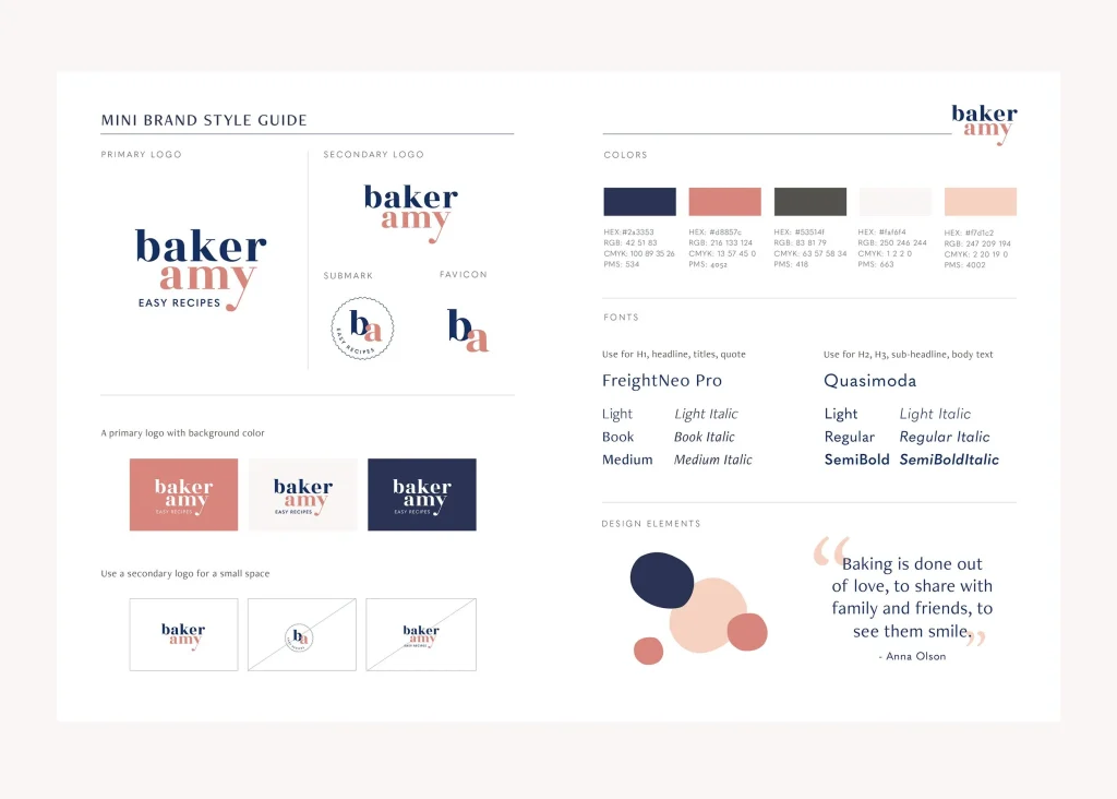
- Logos: When it comes to company logos in branding guides, you don’t need to use every iteration and variation. Depending on the situation, a large and detailed logo for bigger treatment (billboards or full-spread ads), a small logo for small treatments (smaller ads or documents), and a tiny logo for special situations (like digital apps). Include spacing and alignment requirements in the brand guide as well as a few best practices for your logo to help understand how to make your brand’s communication readable and professional.
Here is example of my own logo that I use within my own website that represents what my business is about. Where it spells outs “ICE” and each letter is inside one another which aligns in the shape of an arrow that represents the mission of moving forward and traveling farther to reach our designated goal.
- Color palette: A color palette is a selection or pattern of colors that business use which allows them to identify how they will look. Ideally, include the color scheme, list hex codes, RGB numbers, CMYK details, or Pantone names to ensure they’re easy to find. The brand guide can dictate the use of primary colors across the materials and secondary colors as accents. Like I could make a color palette out of red, orange, white, black, depending on what business is about.
- Typefaces: Fonts are another important design concept in a branding guide which allows for a list of font styles and families that the brand uses including helpful, style guidelines, like the ideal sizing and spacing. Using typography eliminates the guesswork for designers and allows for communication to consistent and clean.
- Iconography: Include a section in your branding guide on imagery, what to use it for and what to avoid as well as to ensure that all of the images your graphic designers use feel consistent and on-brand.
- Tone: With creating your branding guide, make sure that your visual tone matches your design and overall identity that you’ve wanted to influenced throughout brand like if you had a serious and professional tone, you would design your color, typography, logo, and other elements to match it.
Why are Branding guides important?
The reason that branding guides are so important is because it gives the business a certain identity and retrospective on how they represented to consumer who are looking into their products and services. If they have a catchy slogan or unique color palette, anything that allows them to stand out and be recognized by individuals. It is also helpful when it comes to creating websites because they can base it by the brand of the website and can apply the color palette, typography (fonts), imagery, logo, etc. The best brand guideline are short, sweet, and too the point as well as accessible on a company website for changes to be made in real time.
Examples of different Branding guides
Now that we’ve talked about the essentials and criteria’s of creating a branding guide for a business, we’re now going to show some examples of different branding guides with different colors, typography, logos, missions, etc. So, here are 5 examples of branding guides:
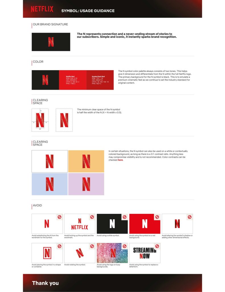
- Netflix – Netflix has set the standard for digital streaming. Their guide focuses on the all-important visual assets that make up their brand identity. Part of what makes Netflix so powerful, after all, is how easy it is for almost anyone to recognize their logo. Netflix stands out by not only describing how their visuals speaks to customers, but also gives detailed information about how, when, and where to use the logo
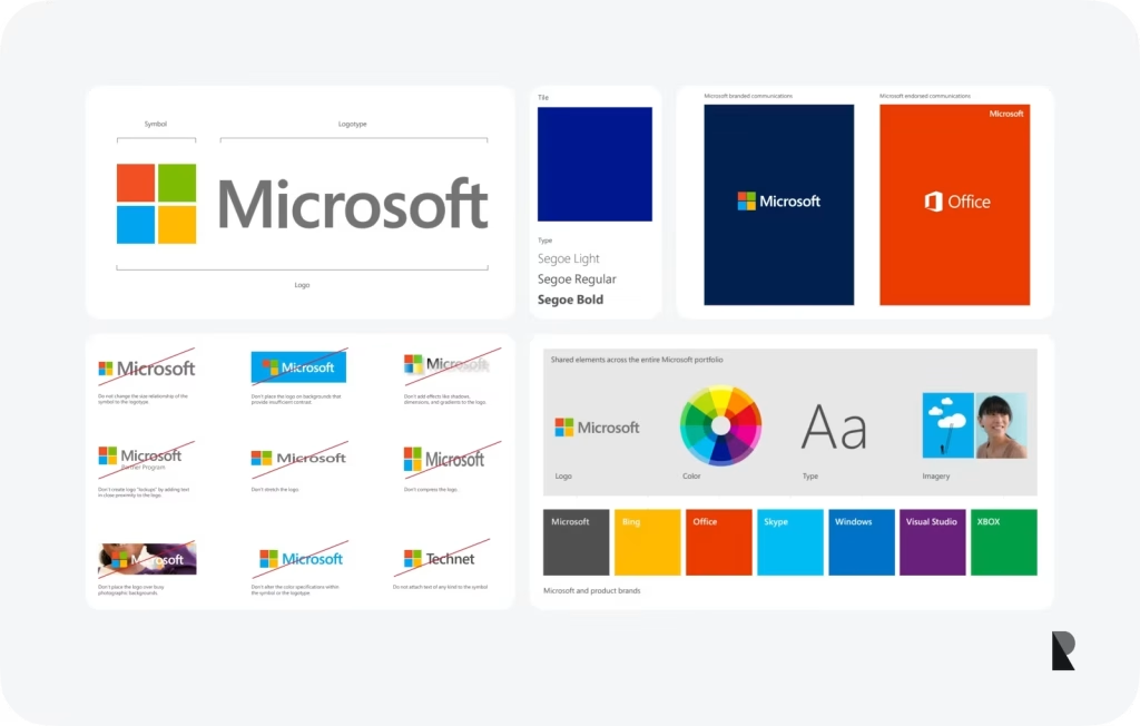
- Microsoft – Microsoft continues to define the way users interact with a personal computer. Their brand style guide explains how to replicate the Microsoft style of writing across different types of content. What makes Microsoft’s guide stand out is the complexity of their guide and how they’ve let users endlessly navigate to find the correct brand standard
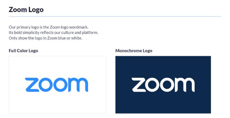
- Zoom – Zoom has taken the world of online communication by storm, surpassing more generic platform like Skype. Their brand style guide gives all the necessary details required to represents the Zoom brand in simplistic, easy-to-navigate fashion. What make Zoom guide stand out is that it contains plenty of white space which allows content like logos and fonts to also stand out and help users get it right the first time.
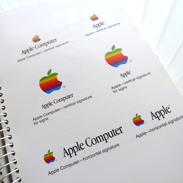
- Apple – Apple manages to be on the cutting edge of technology, forcing the industry to adhere to their own standards when it comes to new tools. Their style guide gives key insight into best the ways to advertise Apple products, including the type of things that detract from the overall Apple message. What makes Apple’s guide stand out is the detail of Apple guide is intense and Apple’s core values and ideals will brought throughout each new project and advertisement
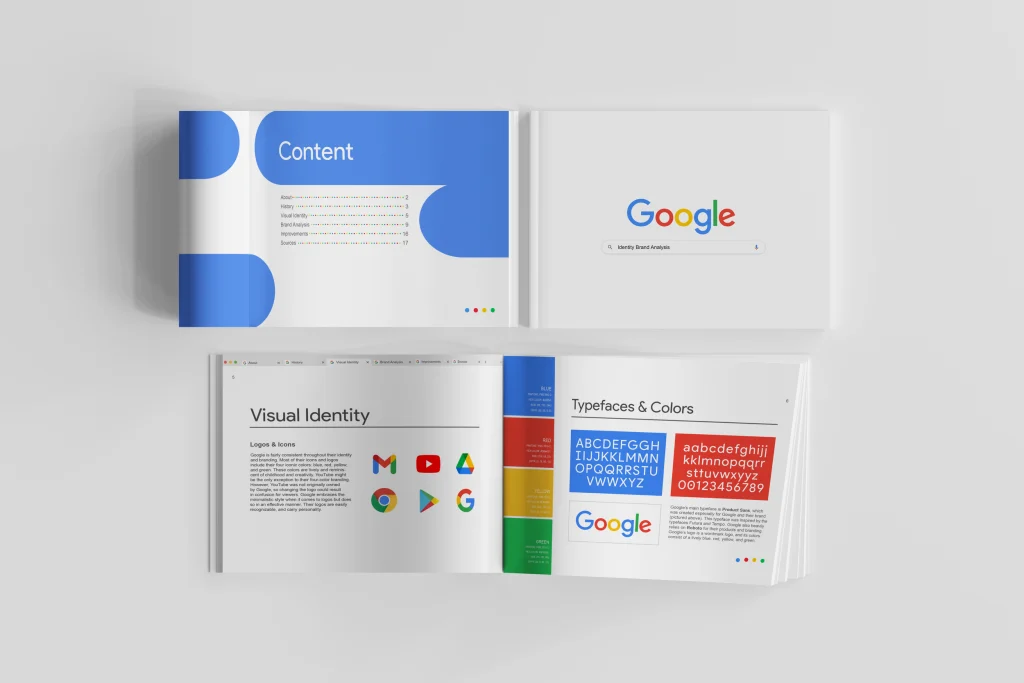
- Google – Google has set itself apart as the search engine delivering the best results and user experience. Their style guide focuses more on formatting than other brands do, which makes sense considering the way the website operates. What makes Google’s guide stand out is the different types of punctuations and spelling it requires as well as loads of information about things like headers, formatting, and linking.
If you would like to see these companies branding guides and why they stand out for yourself, go to: Branding-guide-examples
Conclusion
When it comes to building and creating a professional business, one of the first steps you want to do is to create a suitable branding guide to list many of the designs and content that are going to be displayed in your business as well as gives a certain representation as to what it’s about and their overall mission and goal is for their specific target audience. With elements like color, typography, logos, iconography, tone, or anything else, it is primarily important to build a style guide criteria as to what type of designs you are going to use. So go out there and create your presentable business with your branding guides!